An Observation, 2017 Oly Data
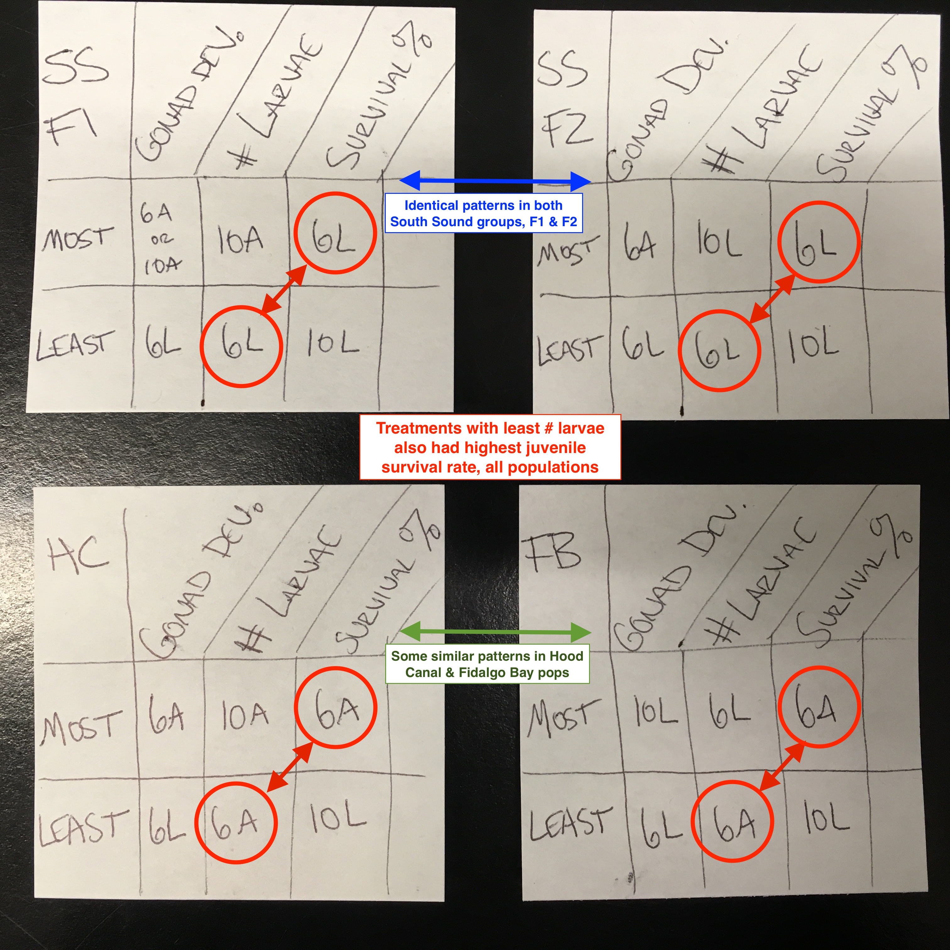
Looking at the Oly data from the 2017 Oly project, I see a couple patterns. Check out the below image, where I simply identify the treatment within each population that had the MOST and LEAST of the following:
- Gonad ripeness post-OA
- Larval production
- % larval survival
The coding as as follows:
- 6L: 6degC, low pH
- 6A: 6degC, ambient pH
- 10L: 10degC, low pH
- 10A: 10degC, ambient pH
My observations:
- The group that spawned the most number of larvae (normalized per oyster) consistently had the poorest larval survival across all populations.
- The South Sound F1 and F2 groups have identical patterns, indicating a genetic component in how the environment impacted phenotype.
- Some similar patterns between Hood Canal and Fidalgo Bay, but less so than the SS F1 and F2
Written on February 12, 2018